Based on a talk, in Esperanto, presented at the Australian & New Zealand Esperanto convention, Melbourne, January 2015
PART I. Myths and half-truths about art
What is looking at art like for you? Is it enjoyable, pleasant and playful? Or confusing, intimidating and even infuriating (especially with modern and contemporary art)? Why can’t one simple appreciate (that is, understand and enjoy) art? I believe there are a number of obstacles. These are myths and half-truths about art. Half-truths are actually trickier than falsehoods, because one can’t simply disprove them. They have some truth, but not all. Here are a few:
“Art appreciation is hard, and requires years of study.”
The good news is that practising art appreciation over time always pays dividends. But guess, what is the best single thing you can do to increase your level of art appreciation? It’s simply to expose yourself to art! And to continue doing this, with a mind as open and non-judgemental as possible.
“To be able to talk about art gets you accepted in the ‘right’ circles.”
It depends on what you mean by “right”. Isn’t it sad that art is used as a kind of social contest? And unfortunately, this phenomenon is self-perpetuating.
“It’s all subjective, isn’t it?”
Another way of saying this is, “There’s no such thing as good or bad art,” or, “I don’t know much about art but I know what I like.”
That art is subjective is partly true, so it is a half-truth, and its appeal is irrefutable. However, there is a quote which I think is the best response to this:
– EH Gombrich, The Story of Art
So, don’t judge too early. Don’t ‘close the door’.
“Art should be beautiful.”
It depends on what you mean by “beautiful”. For example, consider the painting by Goya, The third of May, 1808 (picture 1).
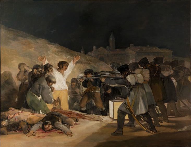
Maybe we could describe this effect as a “ferocious beauty”? This painting shows a separation between subject and style: The subject is not beautiful, obviously, but many would say the style is indeed beautiful. Let’s look at an artwork which was certainly meant to be beautiful, in both subject and style. Even the “title” says as much: “Positive, beautiful, artwork, art, trees, moon, earth” (picture 2).

In other words, it is commercial background art for computers. So, is this more “beautiful” than the painting by Goya? One could maybe describe its “beauty” as clichéd, too sweet, formulaic, empty and without content.
“Art should show skill.”
This half-truth is often used as an excuse for not participating in art more. Let’s change the question, for now, from “Does art require skill?” to “Is skill sufficient for good art?” Look at picture 2 again. The artist’s skill is undeniable. But does this fact, alone, mean that the artwork is good?
“Art is not for everyone.”
Another way to say this is, “I’m not artistic.” The answer to this myth is essential the same as to the first. Anyone can be an art expert. One only needs time and an open mind.
“The artist is the only real expert.”
This may be true, while the artist is working on an artwork. But, as soon as that artwork is finished and leaves the studio, it belongs to the world. For example, the Australian artist Jeffrey Smart asserted many times that his paintings were like “abstracts with a subject”. In other words, although he often painted people in strange, urban scenes, with dark skies and strong shadows, he insisted that his paintings were always about things like form and colour, and nothing else. But many people (including art historians) don’t completely believe him.
Of course, for some artworks, we don’t have declarations by the artist. Instead, we have “historical context”.
“To properly appreciate art, you need to know the historical context.”
Context can actually take you away from an artwork. For example, can we look at the paintings of van Gogh without thinking about the tortured mental life of the artist?
Many years ago, I was in the Museum of Modern Art in New York. I read on a sign near the entrance: “Talk on the art of Marcel Duchamp – starts in… specific gallery… at 2pm.” The art of Duchamp interests me very much, so I went there and waited. The talk was to begin next to an early painting by Duchamp. At 2pm, a guide arrived, introduced himself and began the talk. For a minute, five minutes, ten minutes, he talked about the life of Duchamp, about the art movement “Dadaism”, but he neither looked at the painting behind him, nor pointed at it. I wasn’t there to listen to facts, which I could have read in books. I was there to see real artworks and to learn about them.
An important principle of art appreciation is that there is both internal and external information: one should first look for as much internal information as possible.
“Monetary value shows (or should show) artistic value.”
There’s a simple equation: Monetary value = demand divided by supply. If demand gets bigger, or supply gets smaller, monetary value gets bigger. This principle applies for houses, gold, stamps, and also for artworks.
In fact, it’s possible to fraudulently manipulate the monetary value of an artwork by organising for someone else to buy artworks made by one obscure, dead artist, for slightly higher and higher prices at each sale. The potential buyers take note. The supply of such artworks is constant (and, therefore, limited). So, the price in an “open” market increases.
So, it is clear that monetary value and artistic value are two different things.
“Art has one definition.”
For example, “Art is personal expression.”
What is art? It depends on the reason for an artwork to exist. Different artworks have different reasons, according to three main aims: to represent, to express and to create.
PART II. How can we appreciate art?
Most people quickly glance and judge, and afterwards justify their judgement using their emotional reactions, and afterwards, possible look a bit more. The problems with this method are that it closes the door too early, the door to new experiences.
So, instead, we should firstly…
- look, attentively and non-judgementally, and then, because we have nothing to justify, we can…
- react and relate, and then, if we want, we can…
- be critical.
So, let’s practise our art appreciation:
1. Look attentively
Here are a few sample activities to help you exercise your looking skills. If you want to do these actual activities, look at the painting Implement blue by Margaret Preston.
- Find things or qualities, whose first letter is “S”.
- Find the four shapes below in the painting. (They might be hard to find because there are two types of vision: survival vision – which one uses to recognise, and not accidentally bump into, objects – and aesthetic vision – which is vision for pleasure. Normally, its not necessary to see shadows or the spaces between objects. However, using aesthetic vision we can see independently of what we know.)
- Where is the light coming from?
- Find something that shows that the artist values composition over realism. (The solution is at the end.)

2. React and relate
In other words: make a personal connection. If you immediately like an artwork, this might be easy, but often it isn’t. A common technique, which art teachers and museum guides often use, is to ask, “How does it make you feel?” However, does this really help? How could we reply? “Happy?” “Sad?” Art has more nuances of feeling than that.
Here are a few example activities to help you practise your reacting and relating skills. If you want to do these actual activities, look at the painting Five bells by John Olsen.
- Imagine that you are walking through the painting with bare feet. How does it feel? Is the painting hard, sharp and crusty, or soft, spongey and slimy?
- Imagine that the painting is a person. What is his or her favourite sport? Volleyball? Tennis? Curling? Football? Wresting? Something else?
- Imagine that it wants to escape the Gallery tonight? How would it escape? Silently and stealthily? Or suddenly and noisily?
- What kind of animal would it be?
- What would the weather forecast be in the painting?
- If you could eat it, how would it taste? Like ice-cream? Pizza? Stew? Turkish delight? Chilli squid? Something else?
- What kind of music would it go well with?
3. Be critical
(However, there’s no urgency for this!)
It is tempting to say, “I know bad art when I see it.” However, problems arise when we don’t have criteria. Let’s try together to assess an artwork:
Look at the painting below.
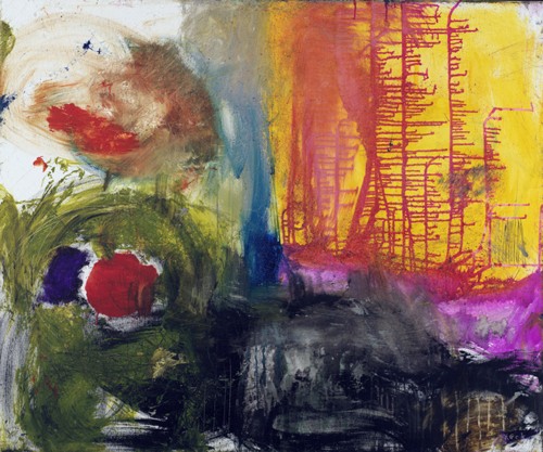
Let’s examine it according to the three main aims: to depict, to express and to create:
- Did the artist aim to depict a part of the real world? No.
- Did the artist aim to express feelings? Maybe, but what kind of feelings? It is very hard to say.
- Did the artist try to create a pleasing composition? Apparently.
The two sides of composition are: interest (to not bore the viewer) and unity (to not confuse the viewer).
Does the painting have interest? Yes, indeed. It has many different colours, shapes, marks etc. But, unfortunately, it doesn’t have much unity – it looks like three or four paintings glued together.
Here is another example, a non-abstract painting:
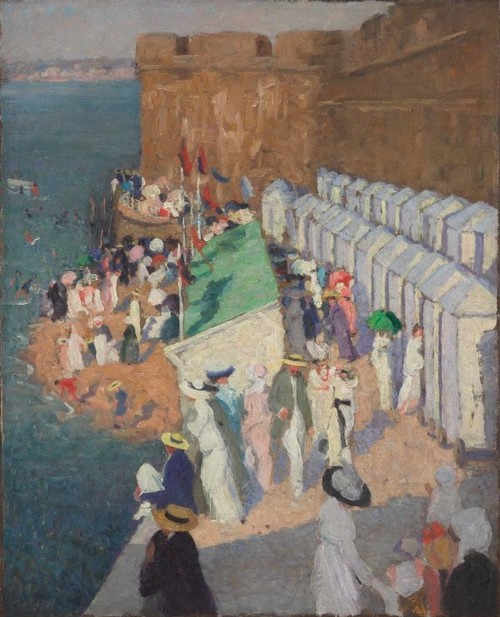
Again, let’s assess the artwork according to the three aims:
- Did the artist aim to depict? Yes.
- Did the artist aim to express? Yes, probably feelings of joie de vivre.
- Did the artist try to create? Yes.
Does the painting depict well a part of the real world? Well, we recognise the objects, but note the linear perspective: the vanishing point is below the horizon!
Did the artist create unity? A pleasing composition? Maybe the blue-green water on the left-hand side doesn’t relate well enough to the rest of the painting.
How well does the painting express feelings? We assume that the artist aimed to express the joie de vivre of a day by the sea, but what do you think about the large stone wall? Do you think that maybe it contradicts the light, airy feeling of the subject?
Sometimes, it is easier to assess when one has a related artwork to compare. Look at the two paintings of flowers (pictures 6 and 7).
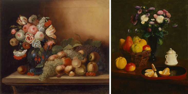
Do you think that the right-hand painting is more convincing? Note how the shadows are missing under the plums in the left-hand painting!
Which painting has a better composition? Maybe the left-hand painter (Gould) couldn’t decide what to do with the top-right-hand corner?
Summary
- Your personal reactions have value.
- Artworks have both internal and external information. Look for as much internal information as possible first.
- The value of your personal reactions, plus the ability to find internal information improves your self-confidence.
- Aesthetic vision (which art feeds) is not the same as survival vision.
- Aesthetic vision is to see independently of what you know.
- To appreciate art, look attentively and non-judgementally, then react and relate, then finally, be critical. Don’t skip a step, however haste is not required for the step “be critical”.
- Give art time.
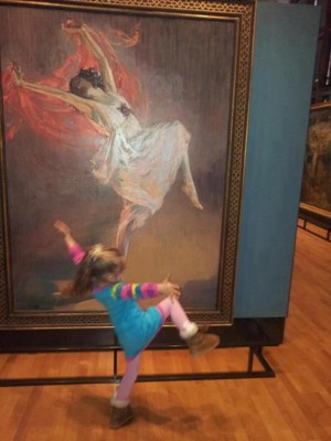
- Don’t forget to ‘dance’! …
Solutions
- “S”: shadows, stripes, saucer, sugar-cube, shiny.
- The shapes are (from the top-left corner):
– The white space between the middle two objects and their shadows, and the right-hand two objects and their shadows.
– One reflection on the jug
– The right-hand half of the shadow cast by the glass with the lemon
– The visible part of the shadow cast by the left-hand cup and saucer - The light came from a lamp behind the table.
- The shadow of the jug seems to lie under the cup and saucer in front of it; and the stripes behind the jug is discontinuous (imagine the jug disappearing). These two facts show that the artist valued composition over realism.
[See also On art appreciation.]