(Based on an AEA lecture via Zoom, Arto estas kiel boksado (Art is like boxing), 20 April 2025)
Controversy in art is not a new phenomenon; it has been around since the Renaissance. This article examines some of the issues that artists have disagreed and argued about over the past 550 years, and hopefully, will explain some interesting things about art. Many of the examples are from the collection of the Art Gallery of New South Wales (AGNSW), where I worked for over 30 years.
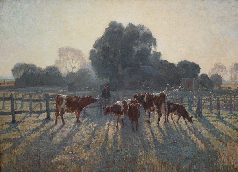
Take a look at the painting Spring Frost by the Australian artist Elioth Gruner (Figure 1). This is probably the most popular artwork in the AGNSW collection, according to frequent visitors. Why? Well, it shows a clever illusion of real vision; it communicates the feeling and memory of frost, the colours are harmonious, and it has a well-ordered composition. In short, it is beautiful and not difficult to understand.
But, every positive comment can have a negative counterpoint. Imagine that you are an art critic and you want to criticize this painting, perhaps to show that you have a less naive appreciation of art than “ordinary” people.
Someone might say: “The painting shows a clever illusion of real vision.” However, to this one might reply: “It is just a trick; the artist is a slave to the principles of perspective.”
“It reminds me of the feeling of frost.” Or… “It is sentimental.”
“The colours are harmonious and it has a well-ordered composition.” Or… “It’s not provocative enough, even boring.”
Interestingly, our reactions to art reveal things about ourselves, especially our expectations.
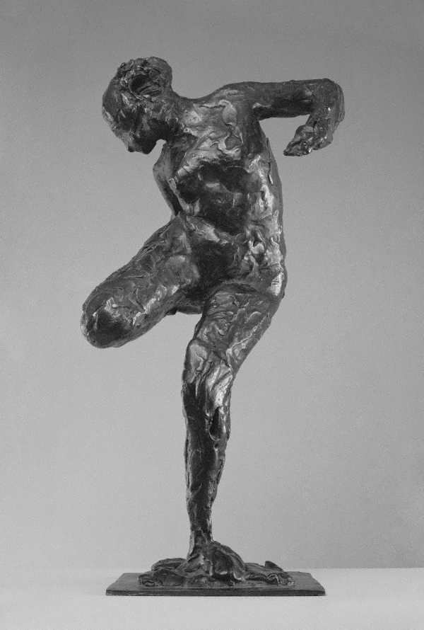
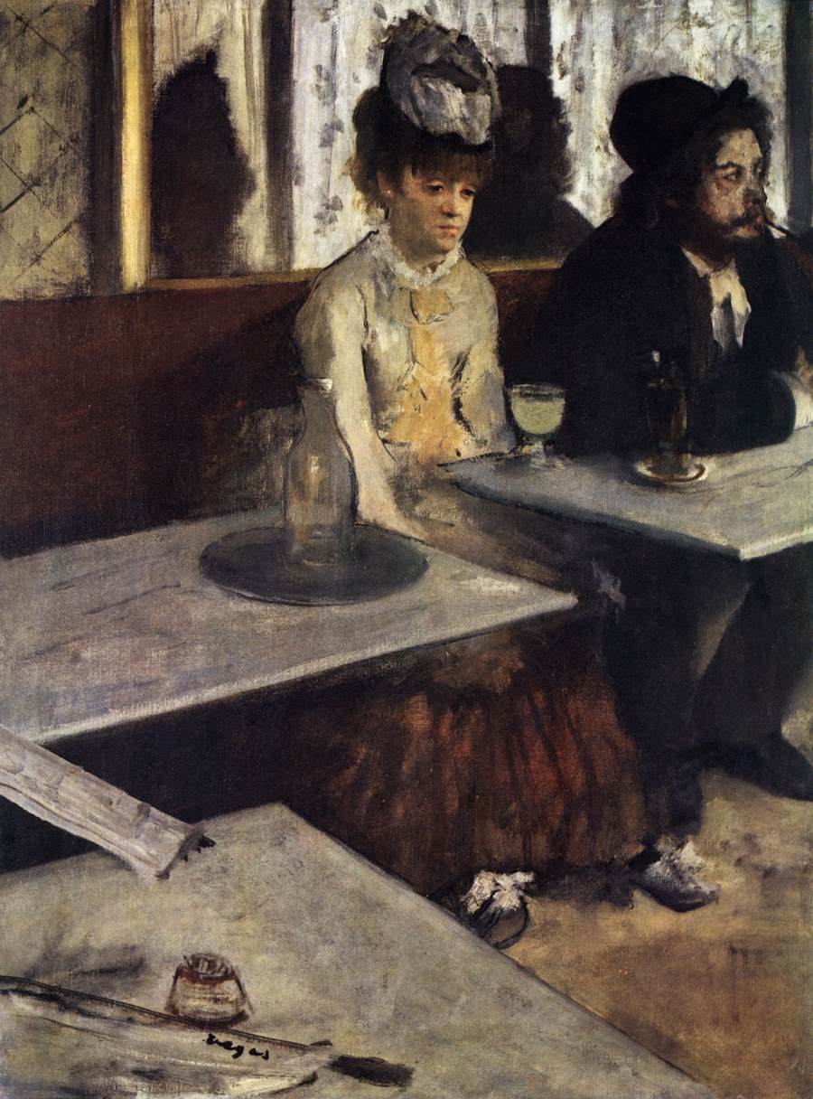
Look at the sculpture made by the famous impressionist painter, Edgar Degas (Figure 2). What criticisms might one make?
Perhaps, “It’s too ordinary.” In that case, the expectation would be: “Art should be more interesting than everyday life.”
Perhaps, “It’s too rough.” The expectation would be: “Art should be refined.”
(Interestingly, people tend to accept roughness in paintings more than in sculptures.)
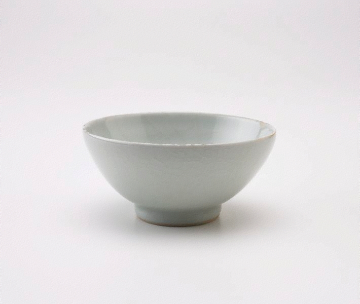
Look at Ivan McMeekin’s ceramic (Figure 3). No one would have a problem with it as a useful object, and many would even describe it as “beautiful,” but is it “art”? (Well, it’s in the AGNSW collection, so it should be, right?)
So, one objection might be: “It’s not art, it’s craft.” And the expectation would be: “Original art (created as a new form) is better than craft (recreated from an existing form).” Furthermore, “Art should be for looking at, not for using.”
Let’s go back to the painting we started with (Figure 1). This now seems very “traditional”, doesn’t it? But it would have been unacceptable to some at some point. For example, imagine it being viewed by the painter of The Widower, the Victorian English artist, Luke Fildes (Figure 4).
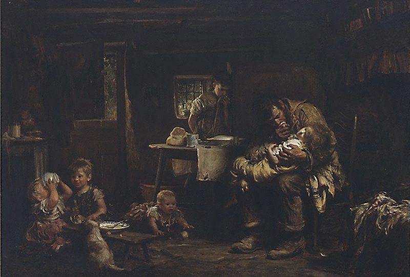
What would Fildes say? Perhaps, “It’s not edifying; it won’t make anyone better, morally. It’s just a picture of some cows.” Now imagine that Spring Frost was being viewed by the painter of a still life in Figure 5, the 17th-century Dutch painter Laurens Craen.
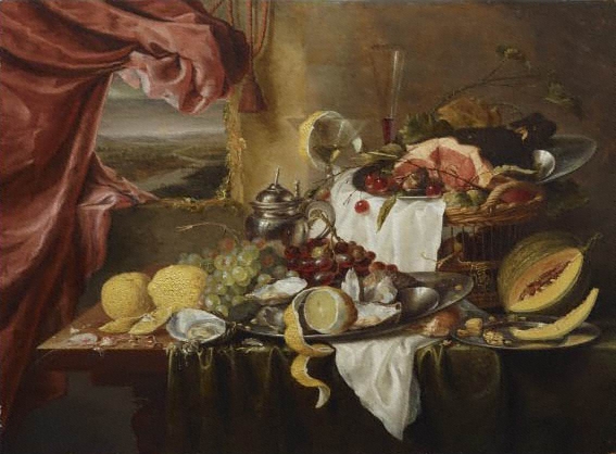
His complaint about Elioth Gruner’s painting would probably be more about technique than subject matter: “The brushstrokes are too obvious; there’s not enough detail.”
So, arguments about art are not just between artists and critics (or between artists and the public) but also between artists and artists.
Battles in art throughout history
Since the Renaissance, there have been battles between artists about what good art means. They are about the subjects of art, and how art treats them.
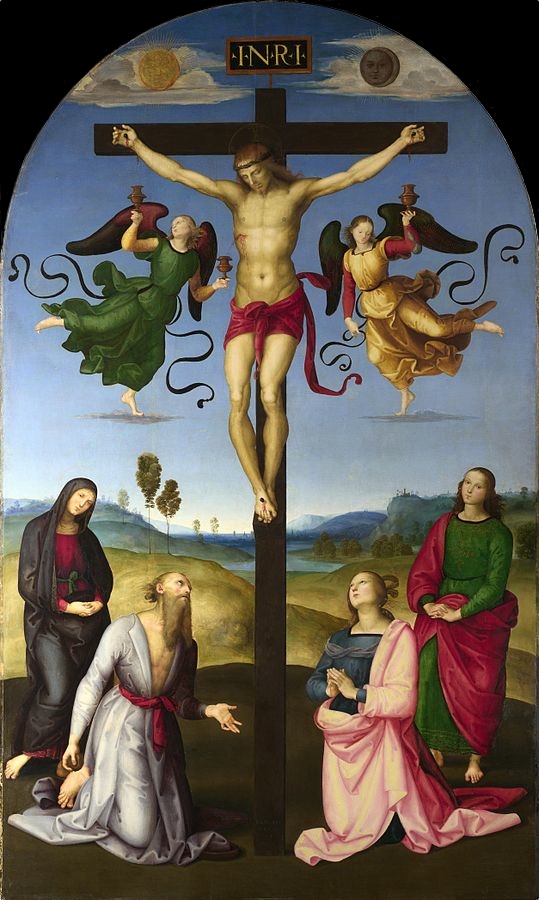
Look at the painting in Figure 6, by the famous Italian Renaissance artist, Raphael. How is the crucifixion of Jesus treated? As a perfect, peaceful event, despite the theme of death and sacrifice. For example, look at the symmetry, the repetition of curves and semicircles, and how the two angels collect Jesus’ blood in cups.
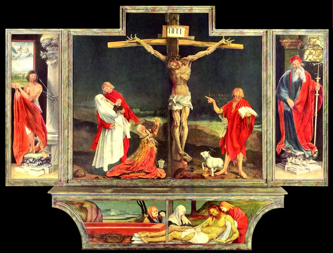
Now, look at the altarpiece painting in Figure 7. It has the same subject as Raphael’s, and was painted at about the same time (but in Germany). How is the subject treated there? As a tragic, imperfect event. Jesus’ body even shows symptoms of the plague, which would make it more relatable to contemporary viewers.
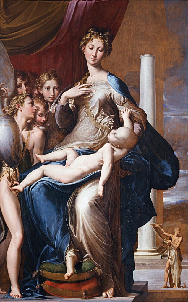
Back to Italy, but a little later: look at the painting in Figure 8. The subject is not the crucifixion, but Jesus as a baby, and his mother. The subject is treated in a very strange way. The composition is unbalanced and the figures are distorted. The style of art was once known as the “Late Renaissance,” but is now called “Mannerism.” Artists of the time felt that the work of High Renaissance artists – mainly Leonardo, Raphael, Michelangelo and Botticelli – was as perfect as art could be. So, since it was impossible to get “more perfect”, they wanted art to at least be more interesting.
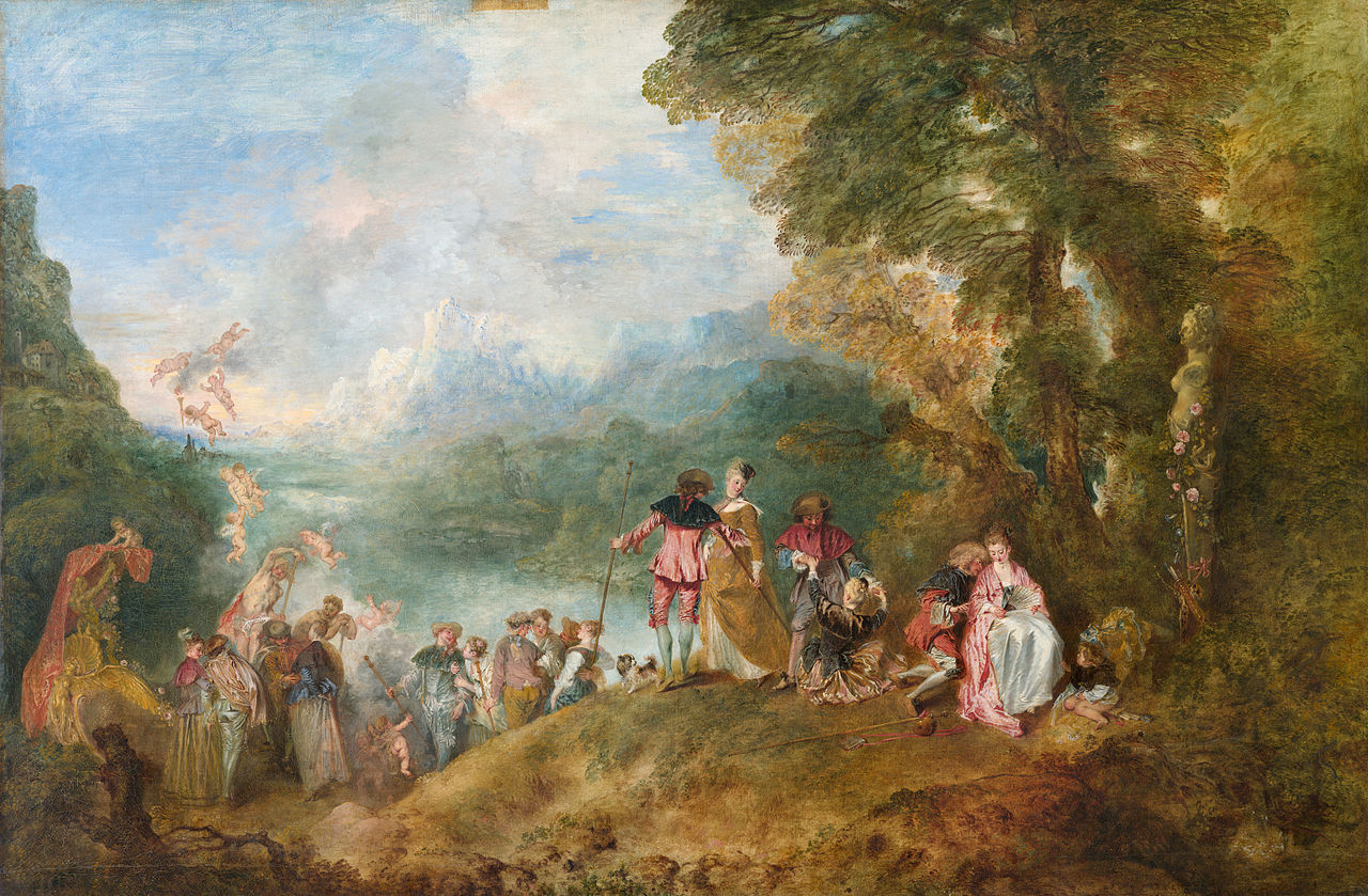
Now we move on to early 18th-century France and the work of Antoine Watteau (Figure 9). The subject is an imaginary event: wealthy people are preparing to go to the island of Cythera (where the goddess Venus was supposedly born). The purpose of art for Watteau was to be like a comfortable couch, so he created a picture that was sweet and light.
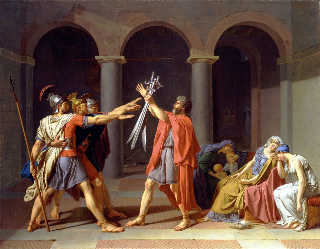
Image 10 shows a painting by the late 18th-century Frenchman, Jacques-Louis David. Three brothers from a Roman family, the Horatii, agreed to end the war by fighting three brothers from the enemy family. The three brothers are willing to sacrifice their lives for the good of Rome. The purpose of art for David was to inspire, and motivate the viewer to perform heroic actions, so he created an image that was heroic, solemn, and “heavy”.
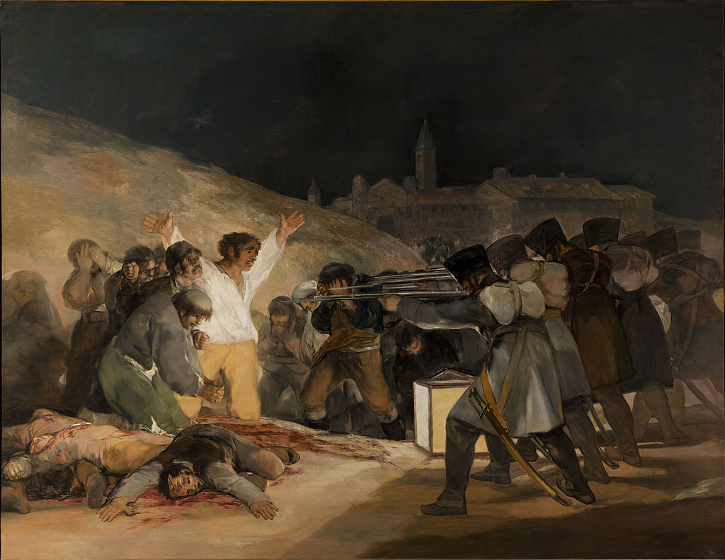
Another painting with the theme of war can be seen in Figure 11. The artist Goya commemorated the Spanish resistance to Napoleon’s armies during the occupation of Madrid. According to him, war is a meaningless, not heroic thing. It is certainly not glorious.
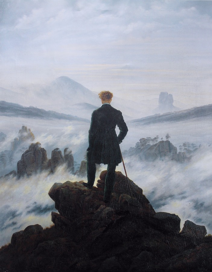
The German romantic artist, Caspar David Friedrich, painted the scene in Figure 12, which glorifies the majesty of nature. The purpose of this art was, as for David, to inspire, however, not to military or political action, but to inspire wonder, or even a solemn fear.
In Figure 13 you will see an early description of modern life. Edgar Degas, the painter (and sculptor) known for his depictions of ballerinas, presents us with an absinthe drinker and her companion. The subject is the tedium of modern, everyday life. Notice how Degas makes it seem like he has captured this scene by chance, as if with a modern camera. Yet the composition – with its zigzag, slanted lines – is very clever, and not at all accidental.
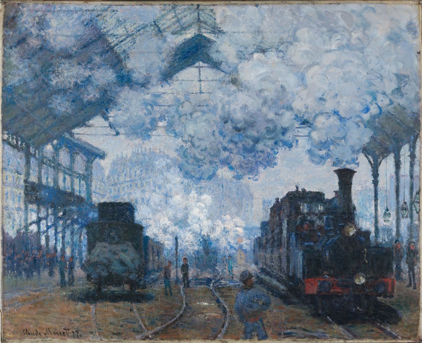
Modern life was also depicted by Claude Monet, in Gare Saint-Lazare (Figure 14). However, in this case, the big, hissing, powerful locomotives, and the clouds of steam, are symbols of an exciting, new world.
We have seen several examples in which artists show different answers to the questions, “What is art for?” and “What does good art mean?” Here are a few more:
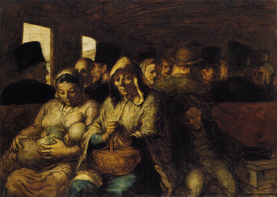
Image 15: Should art be for, and about, the rich or the poor?
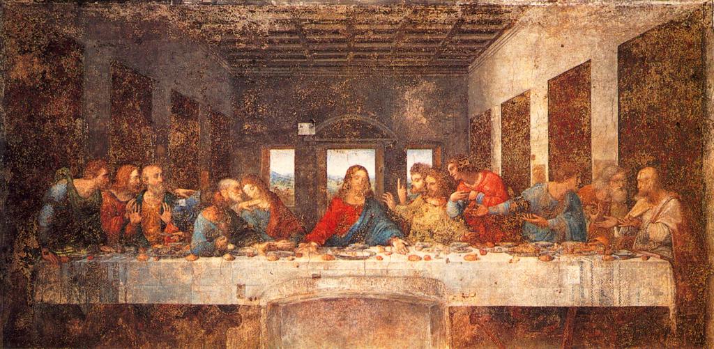
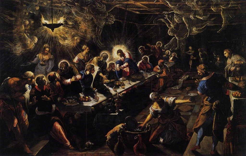
Image 16: Should composition be calm or dynamic?
Another area of argument is the relationship between the artist and the creation of their work.
The supposed way for a painter to work is on a vertical, flat, stretched rectangular surface (an easel), looking at the subject, painting with a brush and artist’s oil paint on a palette.
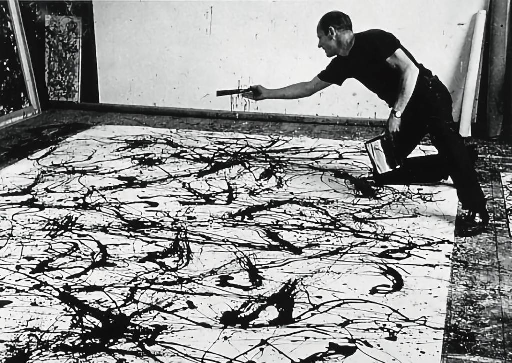
However, look at how the American artist, Jackson Pollock, painted (Figure 17): over a horizontal, unstretched surface, he applied the paint by pouring, dripping, tapping. He was “in” the painting, and did not look anywhere else. In fact, the process of creation was the subject of the painting.
Hans Hoffman, an older artist and mentor of Pollock, once visited Pollock in his studio. He said to the younger artist: “Jackson, you are not drawing from nature. It is not good; you will repeat yourself.” Pollock’s response was: “I am nature!”
A supposed way for a sculptor to work is to carve solid material (stone or wood), acknowledging gravity. So, sculptures are most often more or less solid, sitting on a plinth, on a base (which separates the artwork from the floor and, therefore, the “real” world).
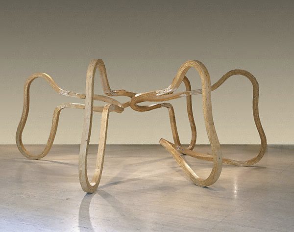
However, the sculpture in Figure 18 is open (you can walk through it). It sits directly on the floor, and it is constructed of laminated wood, which has created a rough surface, because the glue is still visible. However, the sculpture is still an object sitting on a horizontal surface (the floor).
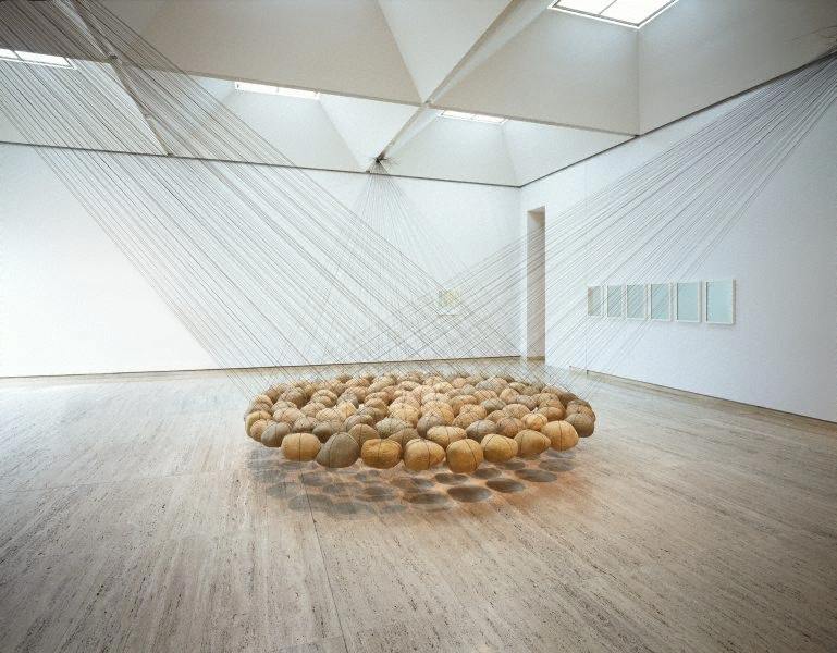
On the other hand, the sculpture in Figure 19 (perhaps the AGNSW’s most popular contemporary work) seems to defy gravity. It is no longer an object sitting, or lying, on the floor, but hanging from the walls.

Artistic argumenting can be compared to a boxing match. Imagine that the paintings in Figures 20 and 21 are boxers fighting each other. I will be the announcer:
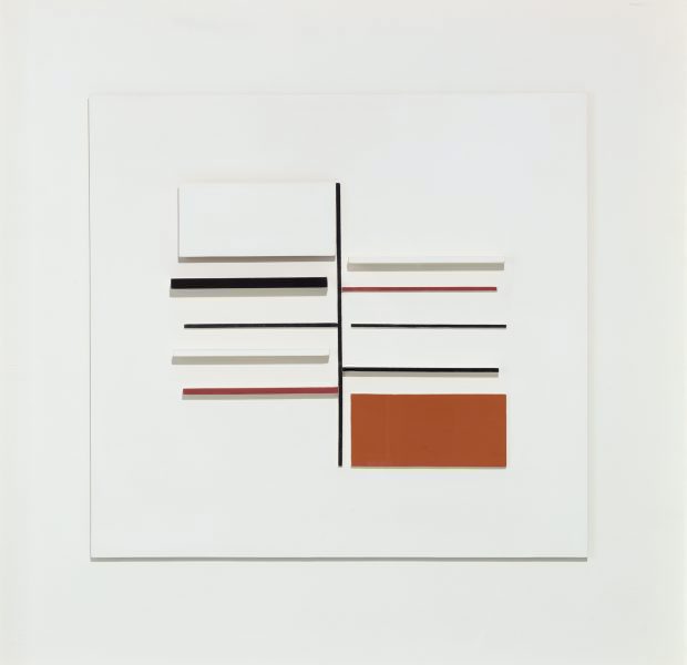
“Ladies and gentlemen! From your state art gallery, we present to you the main battle for today, between Sir Ed Poynter and Vic Pasmore. We are at the frame-side, and let me introduce you to the two painters: [Figure 20] Sir Edward Poynter, wearing multi-coloured shorts, and his opponent, [Figure 21] wearing brown and white shorts, Victor Pasmore.
[20] Sir Edward has been practising art for many years, but his training at the prestigious British Academy, and his fine technique, have maintained his popularity. [21] Victor Pasmore is a more recent addition to the art gallery, but he has attracted quite an appreciative audience among lovers of abstract art.
The referee is now speaking to each painter: he checks the palettes for their whites, and warns against scumbling under the glazes. They now return to their easels… and wait for the bell. [DING!]
[21] The smallness of Pasmore’s painting allows him to work quickly from his corner, [20] but Poynter counters with his wider range of colour – look at those reds and golds, and reds and golds. Those are certainly rapid changes of colour!
[21] But Pasmore’s simple construction, with hardly any colour change, makes Poynter’s style seem heavy and laboured.
[20] Now Poynter hits hard with his patterns and textures: look at the marble and the parallel grooves on the columns!
[21] Pasmore counters with his strong, sharp rectangles. He hardly seems to be moving at all!
Well, two can play at that game: [20] Poynter creates cleverly hidden rectangles in the background. He zigzags all over the canvas, using much more space than Pasmore.
[21] But Pasmore works well in a small area: he just gently presses forward; he hardly seems to be affected by Poynter’s attack.
[20] But now Poynter is bringing his subject matter into play: There’s a tremendous surge of religious feeling as he quotes from the Bible and – despite this matter of religion – there’s more than a little sex appeal for the audience: arm, leg, head, breast! What a spectacle! How can Pasmore overcome this?
[21] Well, Pasmore fights back with smooth surfaces and simple geometry. There is a sense that something very important is happening here; he’s directly invoking the scientific and mathematical fashion of the 1950s. What an attack on shallow storytelling! He’s completely ignoring the world!
Pasmore inserts straight lines. [20] Poynter counters with straight lines. [21] Brightness from Pynter, [20] deep shadows from Poynter. [21] Small, rectangular blocks from Pasmore, [20] the deep illusion of space from Poynter.
[21] But what’s Pasmore doing now? What an unusual tactic! He’s just standing there, lecturing Poynter on composition and geometry! What courage! What endurance! [20] Well, Poynter won’t let him get away with that! He’s lecturing Pasmore on drawing the human body, and anatomy. There’s hardly a muscle out of place, even in the most difficult poses.
Oh! Now there’s a strong movement to the right from Poynter, [21] countered by a balanced arrangement from Pasmore! Both these artists know what makes a good painting, but such a difference in style… [DING! DING!] and there goes the bell for the end of round one.”
Summary
Our reactions to art reveal things about ourselves, especially our expectations.
A good way to better appreciate art is to imagine that the artists of artworks you are looking at are talking to each other about art: Will they agree or not?
Another good way to appreciate art is to find an artwork that you don’t like: imagine that you are a new employee at a commercial gallery; someone walks into the gallery – try to sell that artwork!